
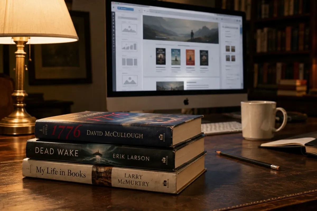
A lot of websites for books put nearly all their energy into the homepage.
That makes sense at first. It’s the front door. It’s where the big author photo goes, where the newest cover gets featured, where the newsletter signup lives, and where someone tries to explain an entire writing career in a few carefully arranged sections.
But over time, I’ve come to think the individual book page often matters more.
Not because the homepage doesn’t matter. It absolutely does. A good homepage gives a reader a quick feel for the author, the genre, the current work, and the world they’re stepping into. It should make someone want to look around.
Still, a homepage is usually where the reader gets introduced.
A book page is where they decide whether to stay.
I’ve worked with major publishers including Simon & Schuster, Random House, and HarperCollins, and I’ve had the chance to do review and publicity work connected to authors such as David McCullough, Erik Larson, and Larry McMurtry, among others. That background has taught me something that’s easy to miss when people talk about “author branding” or book marketing.
Readers don’t really care about branding in the abstract.
They care about whether a book sounds like something they want to read.
They want to know what kind of story they’re walking into. They want to get a feel for the setting, the tension, the subject, the characters, the stakes, and maybe even the mood of the thing. They want to know if it’s the first book in a series, if they’ve missed something, if there’s another title waiting when they’re done, or if it’s the kind of book they should bring to their book club.
That’s why book pages matter.
They give a book the room it needs to make its case.
The Homepage Has a Different Job
A homepage should be welcoming, clear, and current.
When someone lands there, they ought to understand pretty quickly who the author is and what they write. If they write psychological suspense, historical fiction, romance, literary fiction, horror, memoir, or narrative nonfiction, the site shouldn’t make people guess.
The reader should also be able to see what’s happening now.
Is there a new book? Is a series underway? Is there an upcoming event? Is there a newsletter worth joining? Is there a featured title that gives a good entry point into the author’s work?
Those are homepage questions.
The trouble starts when the homepage tries to do everything else, too.
I’ve seen author homepages that include a large biography, six book covers, a few old press quotes, an event calendar from two years ago, a social-media feed nobody has updated in months, several buttons leading to the same retailer, and a paragraph about writing that could apply to almost anyone.
It may all be technically present. But it doesn’t always give the reader a clear place to go next.
A homepage can’t really tell the full story of every book an author has written. It can point readers in the right direction, but it shouldn’t be expected to carry an entire catalog on its back.
That’s what the individual book pages are for.
A Book Page Catches the Reader at the Right Moment
Here’s the thing: people don’t always find authors by searching their names.
Sometimes they do, of course. They hear an author on a podcast, see them at a bookstore, read an interview, or get a recommendation from a friend. They type in the name and see what comes up.
But just as often, they’re looking for a specific book.
They may have seen the title in a bookstore. They may have read a review. Maybe they found it on a library shelf. Maybe they heard about it from a colleague, a book club, a family member, or somebody online who said, “You’d probably like this.”
Sometimes they’re trying to remember a title they heard months ago.
Sometimes they’ve already finished one book and are trying to figure out what comes next.
That person may not care about the author’s entire career just yet. They’re interested in one book. And if the page they land on is thin, confusing, outdated, or basically just a cover image with an Amazon link, there’s a good chance the moment passes.
That’s a missed opportunity.
A reader who lands on a book page has already shown some interest. They’ve taken a step. They are not necessarily ready to buy, but they’re curious.
A strong book page gives them a reason to keep going.
It should answer the questions they’re already asking, even if they haven’t put those questions into words.
What’s this book about?
What kind of reading experience is it?
Is it part of a series?
Do I need to start somewhere else?
What makes this one different?
Where can I get it?
And, maybe most important: is this for me?
That’s where websites for books can really start doing useful work.
A Grid of Covers Isn’t Enough
Most author sites have a “Books” page, and there’s nothing wrong with that. It’s helpful to have a place where readers can see a full catalog at a glance.
But a grid of covers is not the same thing as a collection of book pages.
A reader might see five or six books listed together and still have no idea where to begin. They may not know which books are part of a series, which title is the newest, which one is a standalone, or which book deals with the subject or setting that caught their attention in the first place.
A basic catalog page is useful for browsing. It should be there. But each title should lead somewhere more substantial.
Every book needs its own page.
That doesn’t mean every page has to become a giant sales pitch. In fact, it probably shouldn’t. Readers can spot that kind of thing pretty quickly, and most of them don’t want to be shouted at.
What they want is context.
They want to know what the book is trying to do.
They want enough information to decide whether it belongs on their nightstand, in their e-reader, on their next library list, or in the stack of books they keep meaning to buy.
When we build websites for books, that’s one of the first things I look at. Does every title have a real home? Or are the books being treated like small images that all have to compete for attention on one crowded page?
There’s a difference.
The Book Page Isn’t Just There to Sell
Yes, a book page should make it easy to buy the book. That part is obvious. Readers shouldn’t have to hunt around for retailer links, or click through three menus just to figure out where a title is available.
But the page should do more than that.
A book is not a toaster. It’s not a piece of office equipment. It’s not something people buy just because the specifications look good.
A reader is making a more personal choice.
They’re deciding whether they want to spend time in a particular world. They’re deciding whether they trust an author enough to give them several hours, maybe several days, of their attention. They might want mystery, tension, escape, laughter, romance, insight, atmosphere, history, grief, danger, or a story that lingers with them after they’ve put the book down.
That isn’t always easy to communicate. But it’s worth trying.
Good book-page copy doesn’t simply explain the plot. It gives the reader a feel for the book.
It may establish the central conflict. It may introduce the emotional stakes. It may give a sense of place. It may suggest a question that keeps the story moving without spoiling the whole thing.
For a suspense novel, that might mean focusing on the moment an old secret begins to surface.
For historical fiction, it might mean showing readers the period and place they’ll be entering.
For a family drama, it might be the relationship that begins to fracture.
For nonfiction, it might be the story behind the subject: why this history, person, place, or event still matters.
I’ve read a lot of publisher copy over the years, and I’ve worked around the way books are introduced to reviewers, media outlets, and readers. The strongest descriptions usually don’t give away too much. They don’t try to explain every subplot. They give you just enough to make you lean in.
That same principle applies online.
What a Book Page Should Give the Reader
There isn’t one perfect formula. A literary novelist’s website is going to feel different from a romance author’s, and a nonfiction author may need a very different kind of page altogether.
Still, there are a few things most strong book pages should include.
The Cover, Title, and Basics
The cover needs to be easy to see. It sounds simple, but sometimes it gets buried in a slider, squeezed into a gallery, or made so small that it loses all impact.
The title should be clear as actual text on the page, too. That helps readers, search engines, accessibility tools, and anybody trying to share the book with someone else.
The basics can matter more than authors sometimes realize. Publication date, publisher or imprint, available formats, ISBN, audiobook information, and edition details can all be useful. Librarians, booksellers, reviewers, journalists, and book-club organizers often need that information.
It doesn’t have to take over the page. It just needs to be easy to find.
A Description With Some Life in It
This is the part that deserves more attention than it usually gets.
A publisher’s description can be a great starting point, but it was often written for a catalog, a jacket flap, a retailer page, or a sales sheet. The author’s own website gives you more room. You can make the copy feel a little more human. You can add context. You can highlight the elements that matter most to readers.
That doesn’t mean stretching a short description into eight paragraphs.
It means writing with intention.
Instead of summarizing every plot point, focus on the moment where the book begins to open up. What changes for the main character? What is at risk? What is unsettling, funny, moving, strange, or compelling about the situation?
A psychological suspense novel, for example, might begin with a question that refuses to go away. A fire, a disappearance, a long-buried secret, an accusation nobody wants to revisit. The book page should let readers feel that tension before they ever pick up the book.
A historical novel might use the setting more directly. If the city, era, social world, or real event is part of the appeal, don’t hide it. Readers who love that period may be looking for exactly that.
The copy doesn’t have to sound like an ad. Actually, it’s better when it doesn’t.
Series Order
If a book is part of a series, be clear about it right away.
This is such a small thing, but it makes a real difference. A reader who finds the third book first may be perfectly happy to begin with Book One. But they need to know where Book One is.
I’ve seen series pages where the order is not obvious at all. Covers are arranged by design, not chronology. Titles are mixed together. There’s no “Start Here” button. The reader has to guess.
Don’t make them guess.
A short line—“Book Two in the Harbor Point Mysteries”—can solve the problem. A link to the full series page makes it even easier. And on every book page, it helps to point readers toward what comes next.
People like being guided when they’re interested. It’s not pushy. It’s useful.
Purchase Links That Don’t Create a Maze
Purchase links should be easy to find, easy to understand, and kept reasonably tidy.
Some authors want to include every possible retailer. Others prefer a smaller group of links. Both approaches can work. The important thing is that readers know what they are clicking.
Print, ebook, audiobook, signed copy, independent bookstore, library request, and publisher links can all have a place.
Just don’t make the page feel like a wall of buttons.
If a reader is ready to buy, make it simple. If they are not ready yet, give them another reason to stay. Let them read an excerpt. Let them see a review quote. Let them learn about the setting or the series. Let them join the newsletter if they want to hear about the next book.
That’s a better reader experience than treating every visitor as if they’re one click away from a sale.
Reviews and Endorsements With Meaning
A good review quote can say more than a lot of promotional language.
The best quotes are specific. They tell a reader something about the experience of reading the book.
Maybe the reviewer talks about the atmosphere. Maybe they mention the author’s research, the pacing, the characters, the sense of place, or the way a particular subject is handled.
Those are more useful than a string of vague praise.
There’s nothing wrong with including “gripping,” “compelling,” or “unforgettable” if those words come from a respected source. But readers respond more strongly when the quote gives them something concrete.
A quote about a novel’s “slow-building dread,” “vivid sense of place,” or “deeply researched historical detail” tells a reader far more about what they’re getting into.
And there’s no need to overload the page. A few good quotes are usually stronger than fifteen blurbs stacked on top of each other.
Something Extra
This is where a book page can become more memorable.
Not every book needs bonus material, but the right extra can give readers a reason to stay longer and come back later.
That could be:
- A short excerpt
- Book-club discussion questions
- A Q&A about the book
- A playlist with a few notes from the author
- Historical background
- Research photographs
- A setting guide
- A map
- A character piece
- A related short story
- Reading recommendations
- A note about the book’s origins
For a historical novel, a timeline or a few research notes can be genuinely useful. For suspense or mystery, a small piece of additional material might add to the atmosphere without giving away too much. For a series, readers may appreciate a character guide or a reminder of where the previous book left off.
These things shouldn’t be added just to make the page look bigger. They should feel connected to the book.
Book Pages Help Readers Find Authors
There’s also an SEO side to this, although I think authors sometimes hear “SEO” and imagine a page full of awkward phrases jammed into sentences.
That’s not what good SEO looks like.
Search engines need context. They need to understand what a page is about, who wrote the book, what the title is, how it fits into a series, and what subjects, genres, places, or themes are genuinely connected to it.
That means a page needs real text. It needs clear headings. It needs the title, author name, book description, publication details, and useful internal links.
It does not mean repeating the same phrase twenty times.
If a novel is historical suspense set in Baltimore, say that naturally. If it is a psychological thriller centered on family secrets, say that naturally. If a book explores a particular period in American history, a regional setting, music, architecture, or another real subject, that information should be part of the page when it matters to the story.
This is especially important for websites for books because readers often search in unexpected ways.
They may search for “historical fiction set in Maryland.” They may search for “novels about a missing person.” They may search for a particular decade, city, subject, or type of story. They may not know the author’s name at all.
A well-written book page gives search engines more to work with, but more importantly, it gives human readers a better answer when they arrive.
The Backlist Shouldn’t Be an Afterthought
Most of the publishing world is built around the new release. That is just the reality of it. There is a launch window, an early publicity push, advance reviews, bookstore outreach, interviews, events, and the usual effort to get a book in front of the right people.
Then the next release starts coming.
But an author’s older books do not stop mattering.
Sometimes the backlist is where a reader begins. They may find an older title in a library or a used bookstore. They may hear an interview from years ago. They may come across a recommendation for a book that suddenly feels relevant again because of an anniversary, a news event, a local connection, a renewed interest in a subject, or just the strange way books seem to find readers at the right time.
A good website gives those older books a chance.
Every title should be more than a small cover image sitting in a row under the heading “Previous Works.” Every book should have enough information to stand on its own.
For authors with a series, this matters even more. If a new reader discovers the latest title and enjoys it, the site should make it easy to go back to the beginning. If someone starts with an earlier book, they should be able to move forward without confusion.
A strong backlist can keep working for an author. The website should support that instead of quietly burying older titles.
Author Websites Offer Something Social Media Doesn’t
Social media can be useful. I’m not dismissing it. It can help authors connect with readers, share news, participate in conversations, and build some momentum around a release.
But social media is rented space.
Platforms change. Reach changes. Features disappear. Posts that took time to write can be almost impossible to find a week later. Even a large following does not always mean every post reaches the people who want to see it.
An author website is different.
It is one of the few places where the author controls the presentation. The publisher may have a book page. Retailers will have listings. There may be dozens of reviews, interviews, event calendars, and third-party articles floating around online.
But the author’s own site can bring that information together.
A book page can be updated when a paperback comes out, when an audiobook is released, when a new review arrives, when a book-club guide is added, when an award is announced, or when a new book makes the earlier title relevant again.
That kind of control is valuable.
It also gives readers a quieter place to spend time with the work. They are not immediately pulled into an algorithmic feed or distracted by a dozen competing posts. They can read an excerpt, look at the series order, see what the author has said about the book, and decide what they want to do next.
That’s a better foundation than hoping every future reader catches one particular post on one particular day.
Let the Homepage Introduce. Let the Book Page Do the Work.
A homepage should still be cared for. It should look current. It should make the author’s work easy to understand. It should feature the latest release and give readers a clear route into the rest of the site.
But it does not need to carry every title, every review, every event, every piece of press, and every detail of an author’s career.
That is too much to ask of one page.
The homepage should open the door.
The book pages should invite readers in.
When a new release comes out, the homepage can feature it. The site can add an announcement, an event, a newsletter signup, maybe a few related pieces of content. But the real long-term asset is the individual page for that book.
That page can grow over time. It can collect reviews. It can include interviews. It can link to related articles. It can help readers find the previous title or the next one. It can support the book long after the initial launch period is over.
That is a more sustainable way to build websites for books. The site grows with the author’s career instead of getting rearranged from scratch every time there is a new release.
A Better Question to Ask
When I look at an author website, I do not only ask whether it looks professional.
I ask whether it helps a reader.
Can someone quickly understand what a specific book is about? Can they see what kind of experience it offers? Can they tell whether it is part of a series? Can they find it without being sent through a maze of broken or outdated links? Can they move naturally from one book to another?
Can they find a reason to stay connected to the author after they leave the page?
If the answer is no, the site may still look good. But it may not be doing enough for the work.
The strongest author websites are not necessarily the flashiest ones. They are the ones that make the books feel available. They give every title a real place. They respect the reader’s time. They do not over-explain, over-sell, or bury the most useful information.
They make it easier for the right reader to find a book, understand it, and take the next step.
And in the end, that is what a book page should do.